CSS offers surprisingly versatile tools for creating shapes beyond simple rectangles and circles. Among these, the triangle stands out as a particularly useful element for design. From speech bubbles and tooltips to intricate decorative elements, CSS triangles provide a performant and flexible alternative to image-based solutions. This guide will explore various methods for crafting triangles using CSS, diving into the underlying principles and showcasing practical examples.
The Border Trick: A Classic Approach
The most common method for creating CSS triangles leverages the properties of borders. When you set different border widths and colors on an element, the borders meet at an angle. By making the element’s content area zero-sized and strategically setting the border colors, you can isolate a single triangle.
Understanding the Principle
Imagine an empty square with thick borders of different colors. The corners where the borders meet create angled lines. If we hide the square’s content and make some borders transparent, we can reveal a triangle. This technique relies on the way browsers render borders, which is crucial for understanding its effectiveness.
Code Example: Upward-Pointing Triangle
Here’s how to create an upward-pointing triangle using this technique:
 .triangle-up {
 width: 0;
 height: 0;
 border-left: 50px solid transparent;
 border-right: 50px solid transparent;
 border-bottom: 100px solid red;
 }
In this code:
- `width: 0;` and `height: 0;` collapse the element’s content area.
- `border-left` and `border-right` are set to transparent, creating the sloping sides.
- `border-bottom` is set to a color (red in this example), forming the base of the triangle.
Beyond Basic Triangles: Variations and Customization
The border trick isn’t limited to upward-pointing triangles. By manipulating the `border-top`, `border-right`, `border-bottom`, and `border-left` properties, you can create triangles that point in any direction. Furthermore, adjusting the border widths allows for fine-tuning the triangle’s proportions.
Creating Different Directions
To create a triangle pointing in a different direction, simply change which border is colored and which are transparent. For example, to create a left-pointing triangle:
 .triangle-left {
 width: 0;
 height: 0;
 border-top: 50px solid transparent;
 border-bottom: 50px solid transparent;
 border-right: 100px solid blue;
 }
Customizing Size and Shape
The size and shape of the triangle are determined by the pixel values assigned to the border widths. Experiment with different values to achieve the desired look. Remember to maintain a balance between the border widths to ensure the triangle’s angles are aesthetically pleasing.
Clipping Paths: A More Modern Approach
While the border trick is widely used, CSS clipping paths offer a more modern and flexible alternative. Clipping paths allow you to define a specific region of an element that should be visible, effectively “cutting out” the desired shape.
Understanding Clipping Paths
A clipping path uses coordinates to define the boundary of the visible area. Anything outside this boundary is hidden. This method provides greater control over the triangle’s shape and allows for more complex designs.
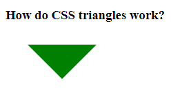
Code Example: Triangle Using Clipping Path
 .triangle-clip {
 width: 100px;
 height: 100px;
 background-color: green;
 clip-path: polygon(50% 0%, 0% 100%, 100% 100%);
 }
In this code:
- `width` and `height` define the dimensions of the element containing the triangle.
- `background-color` sets the color of the triangle.
- `clip-path: polygon(50% 0%, 0% 100%, 100% 100%);` defines the triangle’s shape. The coordinates specify the vertices of the polygon.
The `polygon` function takes a series of coordinates, each representing a point in the shape. The coordinates are expressed as percentages relative to the element’s width and height, offering a responsive approach. Experimenting with different coordinate values will allow you to create various types of triangles with clipping paths.
CSS triangles provide a powerful and efficient way to create visually appealing elements without relying on images. Whether you choose the classic border trick or the more modern clipping path approach, mastering these techniques will enhance your web design capabilities. The key is to understand the underlying principles and experiment with different values to achieve the desired results. By carefully considering the context and desired effect, you can leverage CSS triangles to create stunning and performant web interfaces. With practice, you’ll find yourself incorporating these techniques into your everyday workflow. Remember that browser compatibility should always be a consideration when choosing a method. This flexibility is a testament to the power of CSS.
Beyond the Basics: Skewed Perspectives and Animated Transformations
Now that we’ve laid the foundation, let’s venture into more imaginative territory. Imagine triangles not as static entities, but as dynamic elements capable of shifting and transforming. We can achieve this through CSS transforms, specifically the `skew` property, allowing us to distort our triangles and introduce a sense of perspective and depth.
The Art of Skewing: Injecting Dynamic Angles
By applying `skewX` or `skewY` to our triangle, we can slant its sides, creating trapezoids or even more abstract shapes. This technique is particularly effective when combined with gradients or textures, adding visual interest and a three-dimensional feel. Think of it as bending reality within the confines of your CSS stylesheet.
 .skewed-triangle {
 width: 100px;
 height: 100px;
 background: linear-gradient(to bottom right, #ff0000, #0000ff); /* A fiery gradient /
 clip-path: polygon(50% 0%, 0% 100%, 100% 100%);
 transform: skewX(-20deg); / A subtle slant for added drama */
 }
This code snippet takes our basic clipped triangle and adds a touch of the unexpected. The `skewX(-20deg)` line tilts the triangle along the X-axis, creating a dynamic and visually engaging effect.
Animating the Apex: Bringing Triangles to Life
Why stop at static shapes? CSS animations allow us to breathe life into our triangles, creating subtle or dramatic movements that capture the user’s attention. We can animate the `clip-path` property to morph a triangle into other shapes, or use `transform: rotate` to spin it in mesmerizing ways. Imagine a pulsating arrow guiding the user’s eye, or a shimmering triangular emblem that dances on the screen.
 .animated-triangle {
 width: 50px;
 height: 50px;
 background-color: gold;
 clip-path: polygon(50% 0%, 0% 100%, 100% 100%);
 animation: pulse 2s infinite alternate; /* The magic happens here */
 }
@keyframes pulse {
from {
transform: scale(1);
opacity: 1;
}
to {
transform: scale(1.2);
opacity: 0.5;
}
}
- This code creates a golden triangle that gently pulses, drawing the user’s eye.
- The `animation: pulse 2s infinite alternate;` line applies the `pulse` animation, which is defined using the `@keyframes` rule.
- The animation scales the triangle up and down, creating a subtle but effective breathing effect.
The Future of CSS Triangles: Beyond the Flat Plane
The world of CSS is constantly evolving, and new techniques are emerging all the time. With advancements in technologies like Houdini, we can expect even greater control and flexibility in shaping and manipulating elements. Imagine custom CSS properties that allow us to define complex triangle geometries with ease, or advanced animation techniques that create truly immersive experiences. The possibilities are endless, limited only by our imagination.
So, embrace the power of CSS triangles! Experiment with different techniques, explore the boundaries of what’s possible, and let your creativity soar. These seemingly simple shapes hold the key to unlocking a world of visual delight and interactive wonder. Remember, the best designs are often born from playful experimentation and a willingness to push the limits of what’s expected. Dive in, have fun, and discover the magic that lies within the seemingly humble CSS triangle. Let your imagination become the code. Go forth and create something extraordinary! The canvas awaits your unique vision.